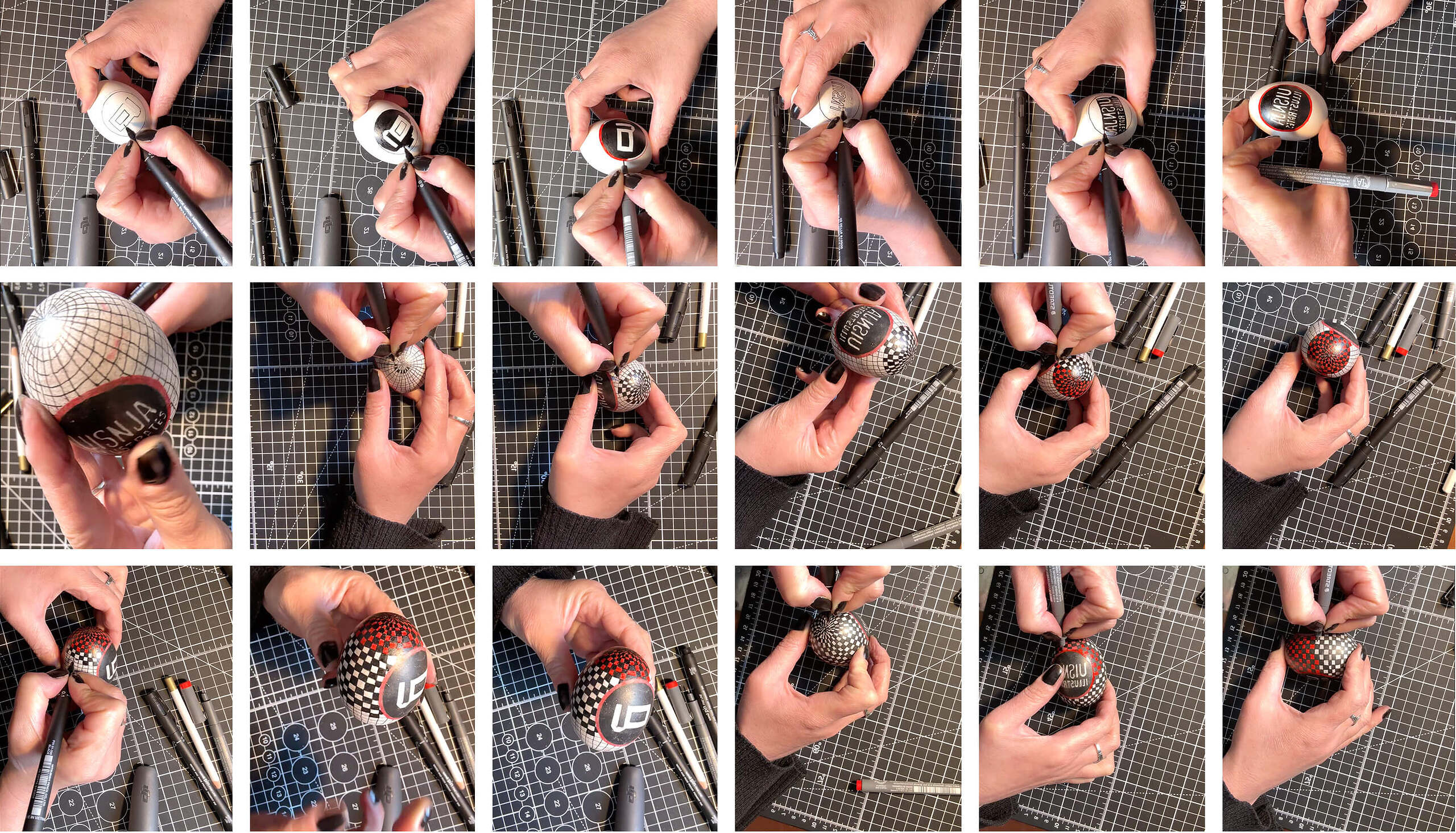
Last weekend was Easter and I hand-branded an egg. This was such a fun and delicate little project as well as a perfect introductory post for my blog. I also made a small frame animation featuring my new coin-flip logo that I created especially for this website.
The logo
My logo dates back to 2009 when I was still a student at the Art Academy in The Hague. It consists of my initials and even though it has gone through a few minor tweaks over the years, it was essentially always the same and I have been using it all throughout my Graphic Design career. However, with the decision to separate my Graphic Design work from the Illustrative, I was faced with another small project: how to create a different version of the same logo for this new website.
After some thinking and a few try-outs, I decided that, rather than making adjustments to the current design, it would make more sense to add an illustrative element to it. This led me to the idea of a double-sided coin, resulting in the animated logo I now have. I found this to be a good way to make it clear that both portfolios remain under the same umbrella, as well as to have a fun solution to label my illustrations.
The egg
I used a pencil to draw the initial outlines of the logo and the checkered area followed by the 0.1 and 0.3 ball pens to do the final drawing. The process was slow and a little tricky because of the drying time and the unavoidable smudging of the ink but it somehow worked out as I managed to get a relatively neat result and create the stop motion animation. Have a look at the process snippets below.